Agency / Brand & operations
Rootkers
An agency needs to look like it knows what it’s doing. Including behind the scenes.
Creative lead & corporate consultant
Let me set
the scene.
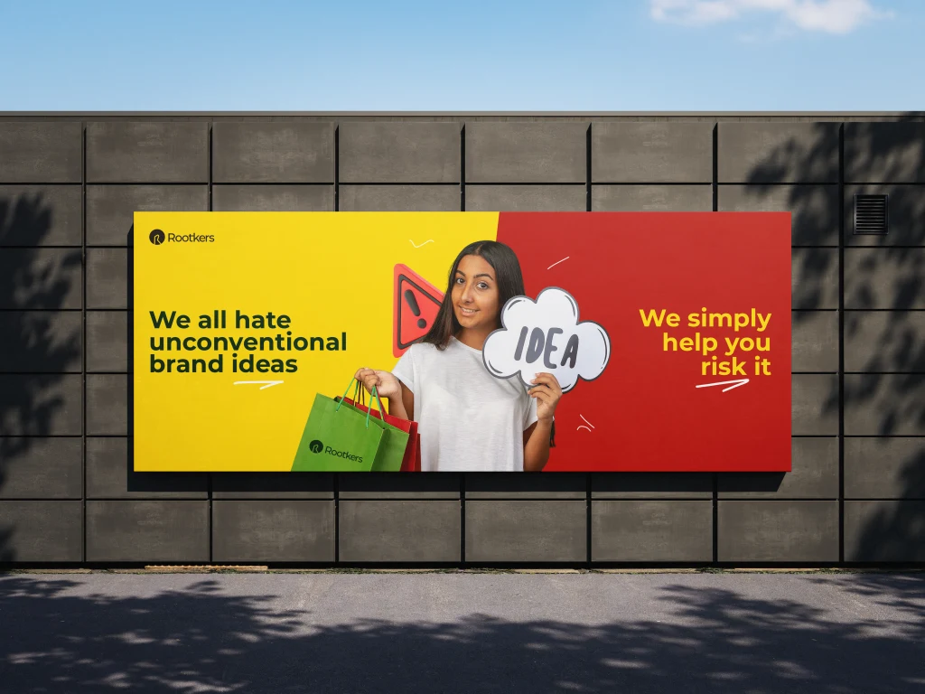
I like this kind of project because there’s nowhere to hide. A marketing agency can talk about building brands all day. Its own brand has to make the argument first. With Rootkers, I worked across the identity, the website, and the operational materials that turn a good first impression into a consistent client experience.
The job wasn’t to decorate a new business. It was to give it a clear position and make that position recognisable everywhere. A polished website would mean very little if the pitch deck, welcome documents, and onboarding process felt like they belonged to three different companies.
What happens after someone likes the website?
Start with what the agency needs to say
I worked on the positioning and messaging before treating the identity as a styling exercise. Who is the agency for? What should a prospective client understand quickly? What should the brand make easier to explain? Those decisions gave the visual work a purpose. The logo, colour palette, typography, and asset templates could then belong to one coherent system.
Build a website that helps the conversation
I designed and built the website in WordPress, with a responsive layout and a clear path from understanding the offer to making an enquiry. I wanted the experience to feel considered without asking visitors to work for the information. The point was to make the agency easier to understand and easier to contact.
Keep going past the public-facing work
This is the part I think gets missed too often. I developed client onboarding packages, welcome documents, and corporate decks alongside the identity. I also advised on client communication workflows. The brand needed to hold together when a real project started, not just when somebody took a screenshot of the homepage.
What I made
and put in place.
- Brand positioning and messaging framework
- Logo, colour, typography, and reusable digital assets
- Responsive WordPress website
- Client onboarding and welcome documents
- Corporate presentation materials
What changed.
Rootkers came away with a connected brand presence and a practical foundation for working with clients. The website, identity, and operational materials were designed as parts of the same business, rather than separate design requests.
What stayed with me.
This project says a lot about where I’m going. I enjoy making the visible work good. I also want to fix the messy handoff that stops good work from happening again.
If your business looks ready on Instagram but feels improvised behind the scenes, this is the kind of problem I like getting into.
Let’s talk about itNEXT STORY
CheckMyPeople
I gave a technical service a more human voice, across AI video, social, print, and transit.